Bernbacher – Strengthen brand presence be bold. be present.
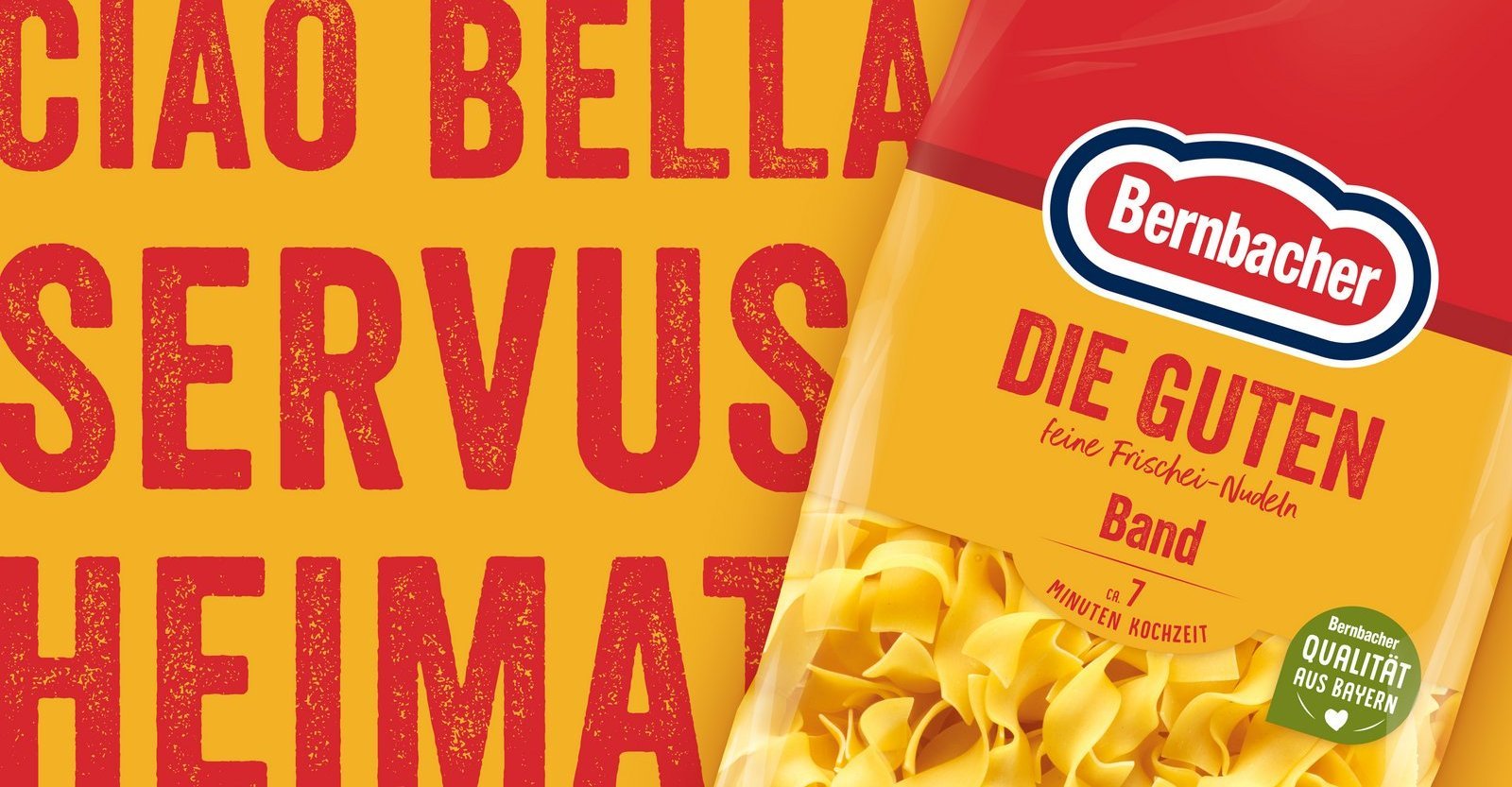
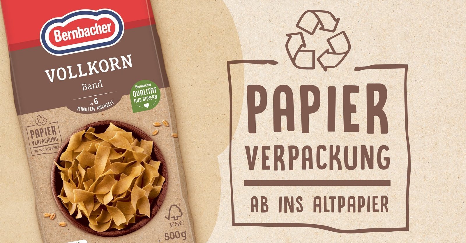
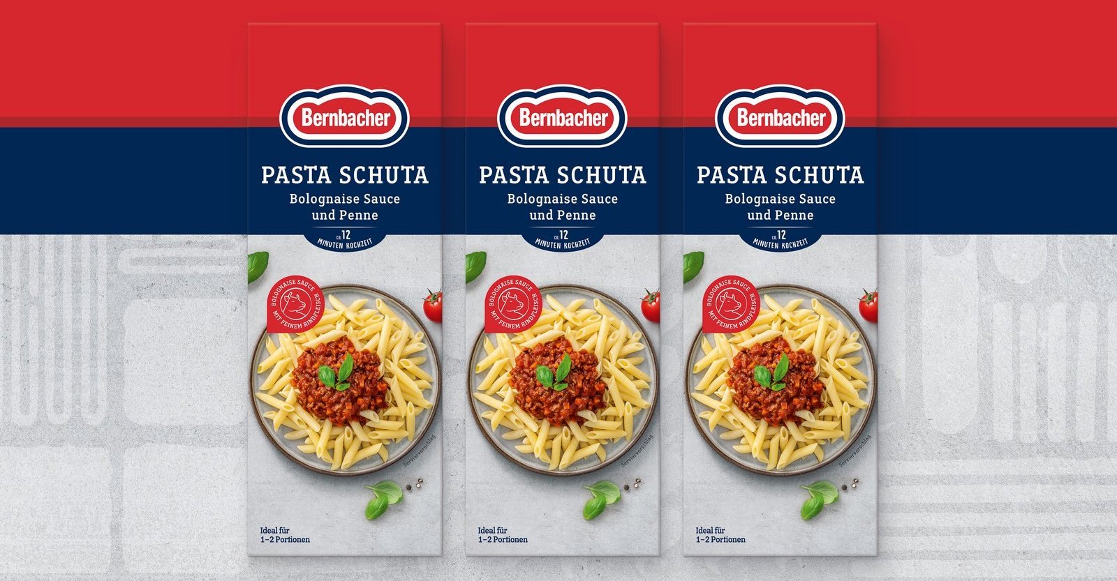
We have tidied up and restructured. The familiar bib and paper background have given way to a clear design. The brand colour red takes on the main role and, in combination with the variety colours, offers quick orientation on the shelf.
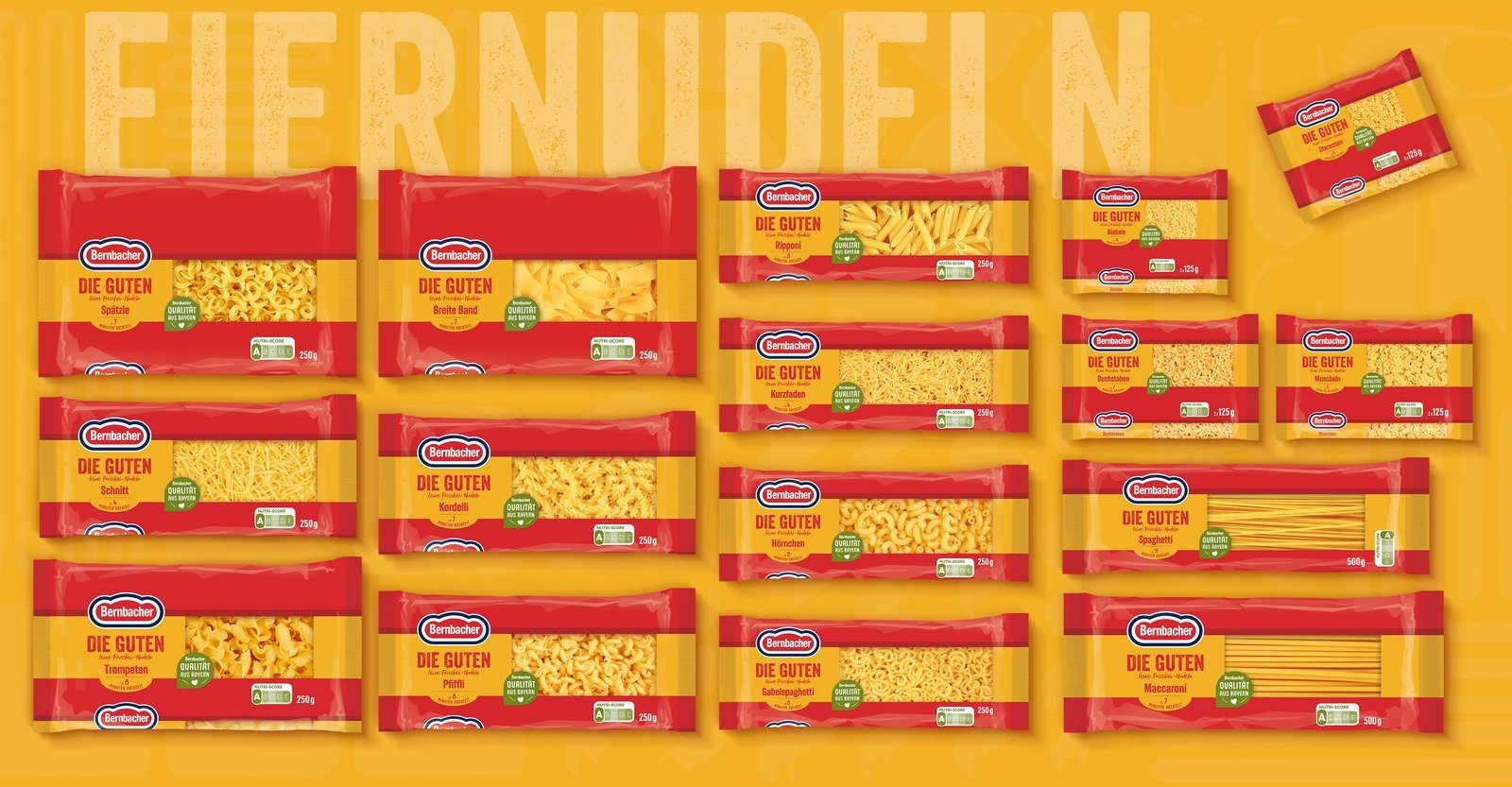
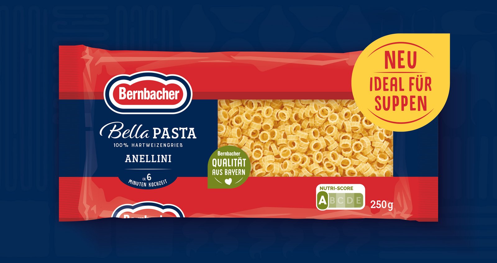
The entire product range, consisting of "Die Guten", "Bella Pasta", "Bio Dinkel", "Dinkel" and "Vollkorn" products, follows the new architecture. The 70 or so SKUs create a harmonious presence on the shelf and a strong block formation. The protected "Bernbacher Qualität aus Bayern" (Bernbacher quality from Bavaria) disruptor lends emotionality to the design and gives consumers the security through high standards.
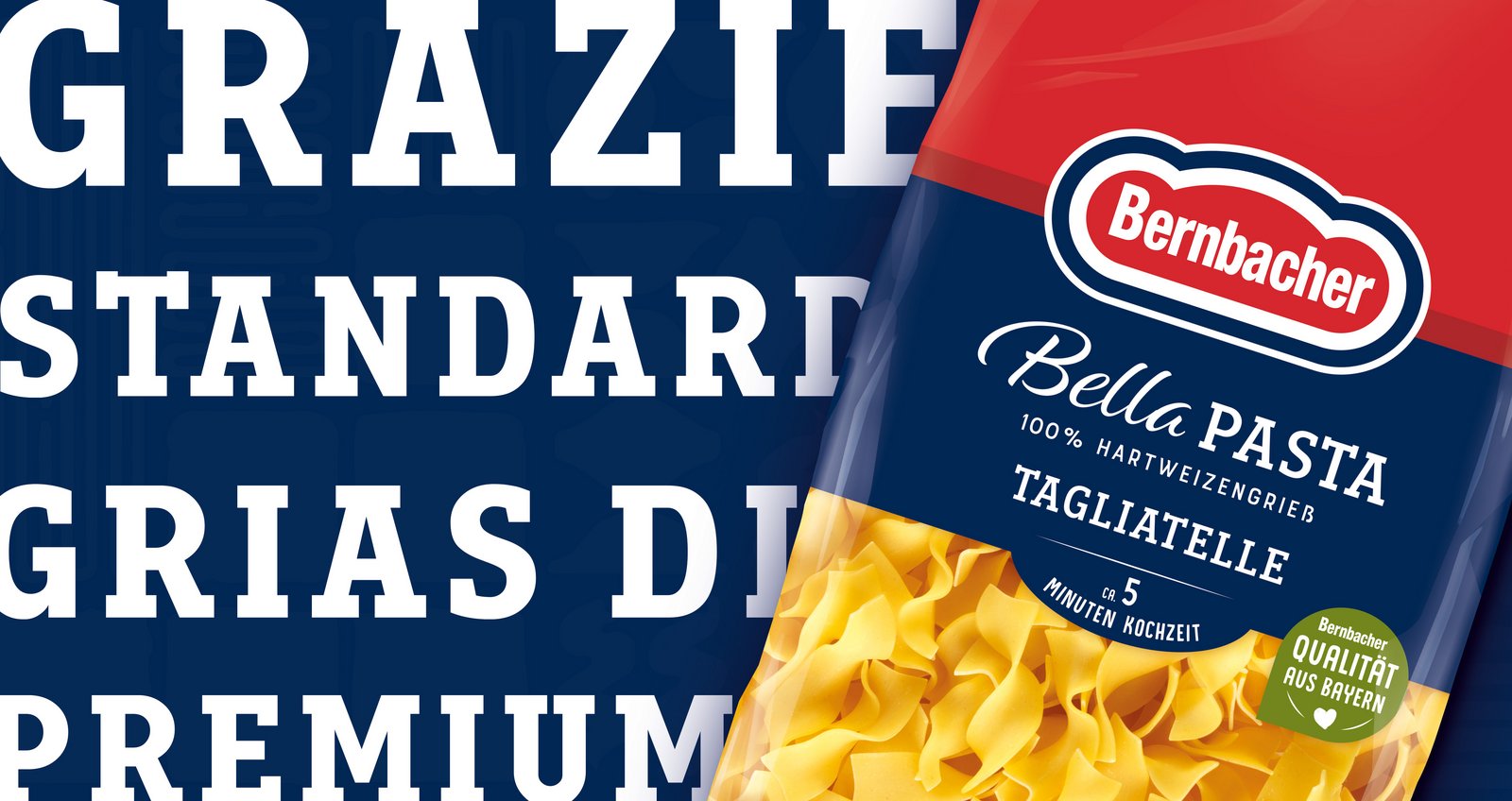
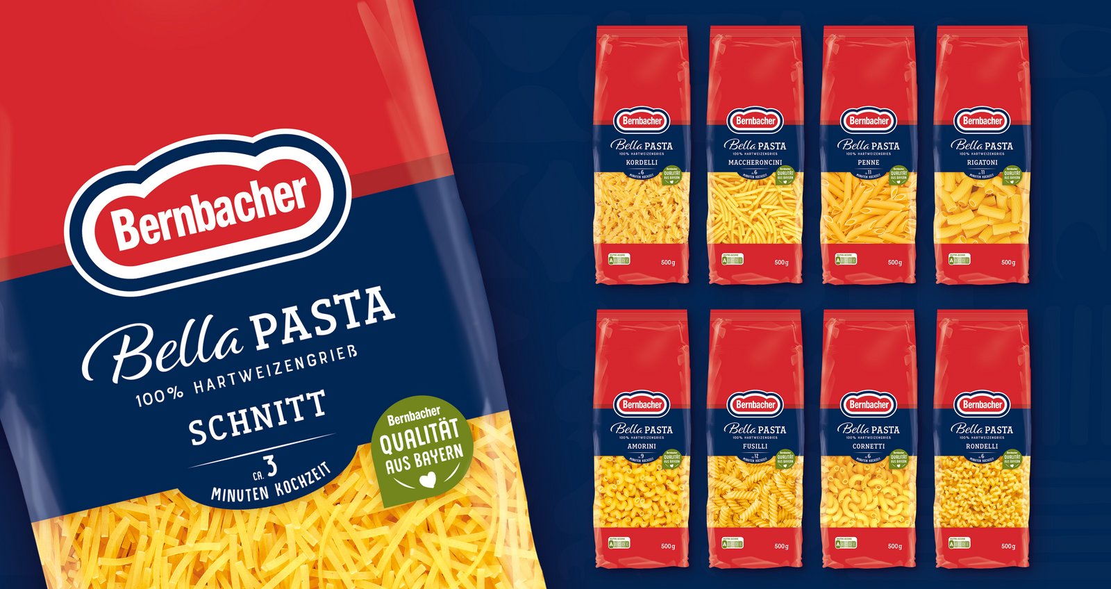
New product additions to the Bella Pasta range
As part of the relaunch, the Bella Pasta range has been expanded to include two new 250g products, which serve as an egg-free alternative to the "Die Guten" soup noodles. This expansion reflects Bernbacher's commitment to meeting the different needs and preferences of consumers.
Sustainability and material savings
In addition to the new design, material savings also play an important role. Bernbacher has deliberately dispensed with the previous resealable sticker on the packaging, which helps to reduce plastic consumption and packaging material overall. This step emphasises the company's commitment to sustainability and resource conservation.
Trust pays off - and so does quality.
This time, too, we were able to relaunch ourselves. We greatly appreciate the Bernbacher brand's long-standing trust in our work.
FACTS
- Packaging design for 70 SKUs plus promotional packaging
- In-house photo shoot
- Final artwork
- Print approval
- Tray design